FAQs
What is this about?
The UK is unique in prescribing that new height restriction signs on bridges and tunnels must give the clearance height in both metres and feet and inches.
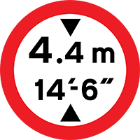
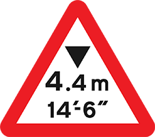
Heights on these signs are rounded: for safety’s sake they are always rounded down.
But how exactly are they rounded? The Department for Transport’s traffic signs manual (chapter 4, 2018) gives the rounding rules separately for metric and imperial:
For imperial:
7.4 The imperial figure shown on signs to indicate the available headroom should be at least 3 inches less than the measured height to allow a safety margin. If the resulting figure is not a multiple of 3 inches, it should be rounded down to the nearest lower multiple of 3 inches.
For metric:
7.5 To obtain the metric figure shown on signs, the bridge height should be measured to two decimal places, rounding down to the nearest 0.01m. The following method is then used to calculate the appropriate signed height:
- if the second decimal digit is 8 or 9, delete it and sign the bridge with the remaining whole number and the first decimal digit,
- if the second decimal digit is 7 or less, delete it and reduce the first decimal digit by 1. Sign the bridge with the remaining whole number and first decimal digit, as reduced.
These aren’t equivalent – it is possible for the same metric measurement to have different imperial measurements, and vice versa!
For each measurable bridge height, here’s what the sign should read:
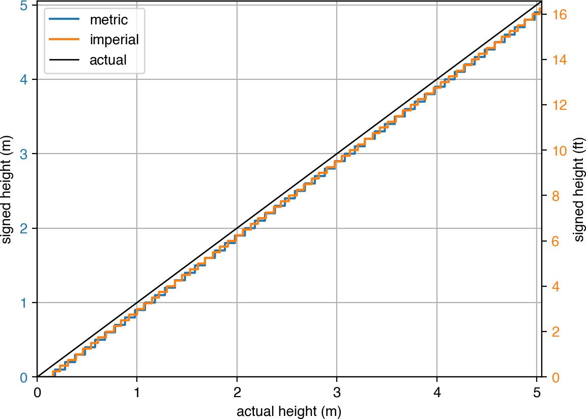
In between 3 and 4 metres alone, there are 24 possible signs!
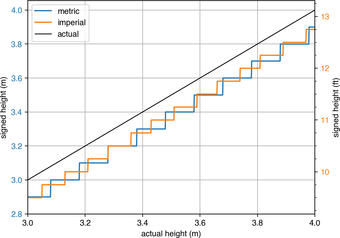
This website is dedicated to finding all the possibilities. Join the Height Hunt!
Why are some signs circles and some triangles?
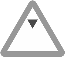
Circular signs represent mandatory orders (no vehicle above this clearance may pass), and triangular signs represent warnings. The current version of the traffic signs manual, chapter 4, recommends circles for non-arch bridges:

7.7.1 Mandatory signs should normally be used at non‑arch bridges, as they can give more effective protection than warning signs. […]and triangles for arch bridges:
7.7.3 It is not recommended practice to place a warning sign […] on a non‑arch bridge as an alternative to a mandatory sign. […]

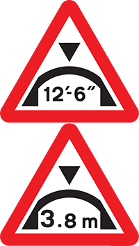
7.8.1 Mandatory signs are not used at arch bridges, as the main risk to these comes from vehicles which, although low enough to pass through the central part of the arch, might strike the curved shoulder of the structure. […]
It is not clear to me why one shape gives ‘more effective protection’ than the other.
This recommendation has not always been the case.
Until 1944, signs warning of upcoming low bridges merely warned of a ‘low bridge’, with no specific restriction. The bridge itself was marked with a rectangular black-on-white plate, giving the headroom. (You can still find some of these on older bridges!)
But in 1944, advance warning signs were modified to include specific height restrictions [1]. The bridge plate remained the same:
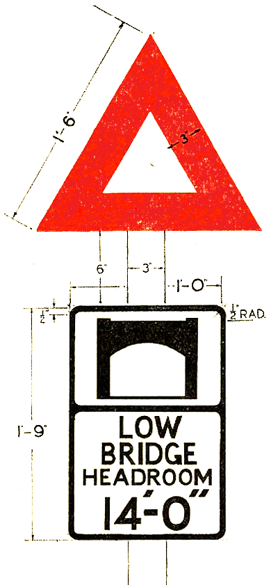
1944
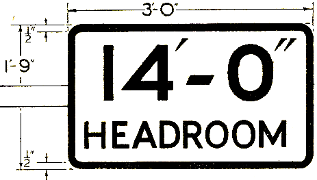
1944
In 1963, the UK’s road signs were refreshed following the Worboys report. Existing signs were denounced as small, too dependent on text, and with their all-caps, black-on-white messages, unsuitable for modern, high-speed driving. Instead, colourful continental-style symbols, along with the familiar new typeface, were brought in.
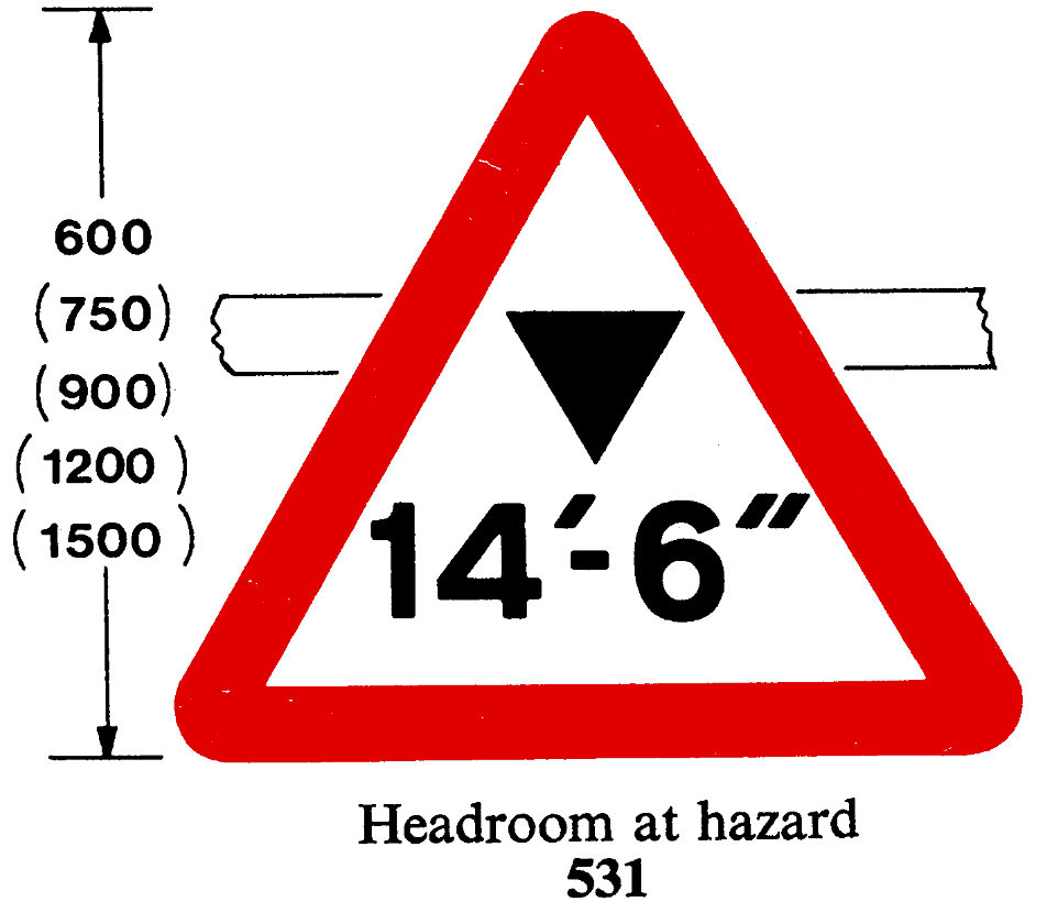
Under this system, the only option for signing height restrictions was the triangle. There were two versions: the one for use on the structure itself had the bottom black triangle removed to allow for larger numerals, compensating for being mounted at height: [2, 3]
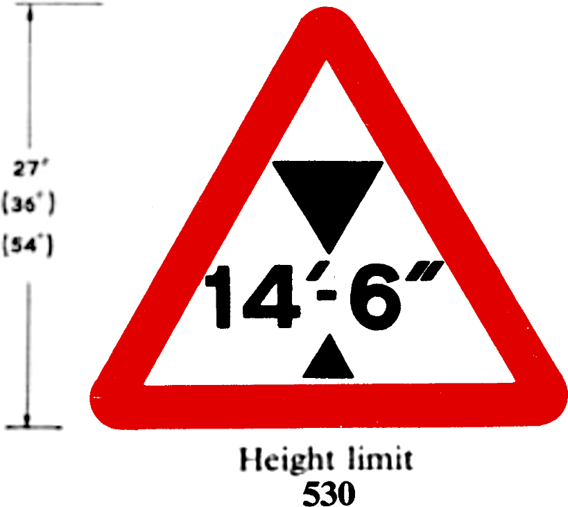
1964
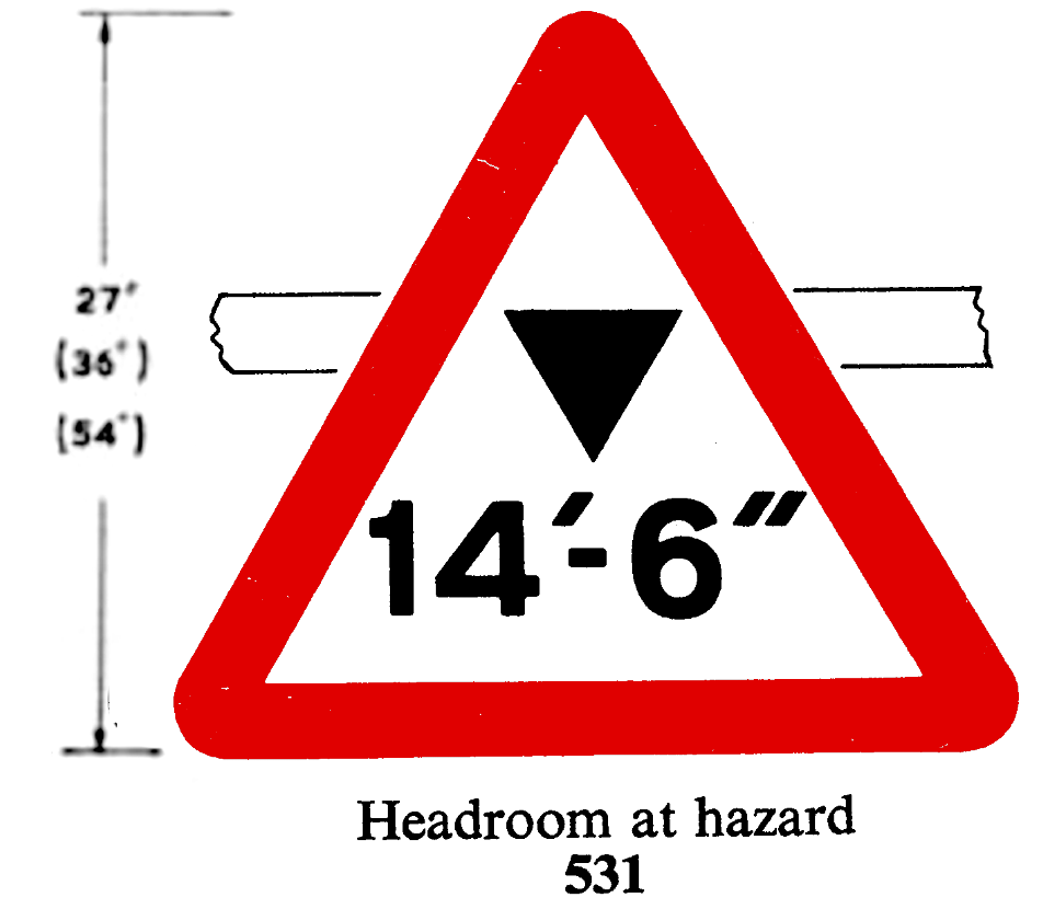
1964
In 1975, circles became available available if the authorities applied for a traffic regulation order. Ignoring this sign would constitute an offence under Section 36 of the Road Traffic Act (similar to running a red light – something that the police could prosecute quickly). The application was considered a bit of a faff so low-risk flat bridges, and of course arch bridges where very thin vehicles could legitimately pass through, continued to use triangles: [4, 5]
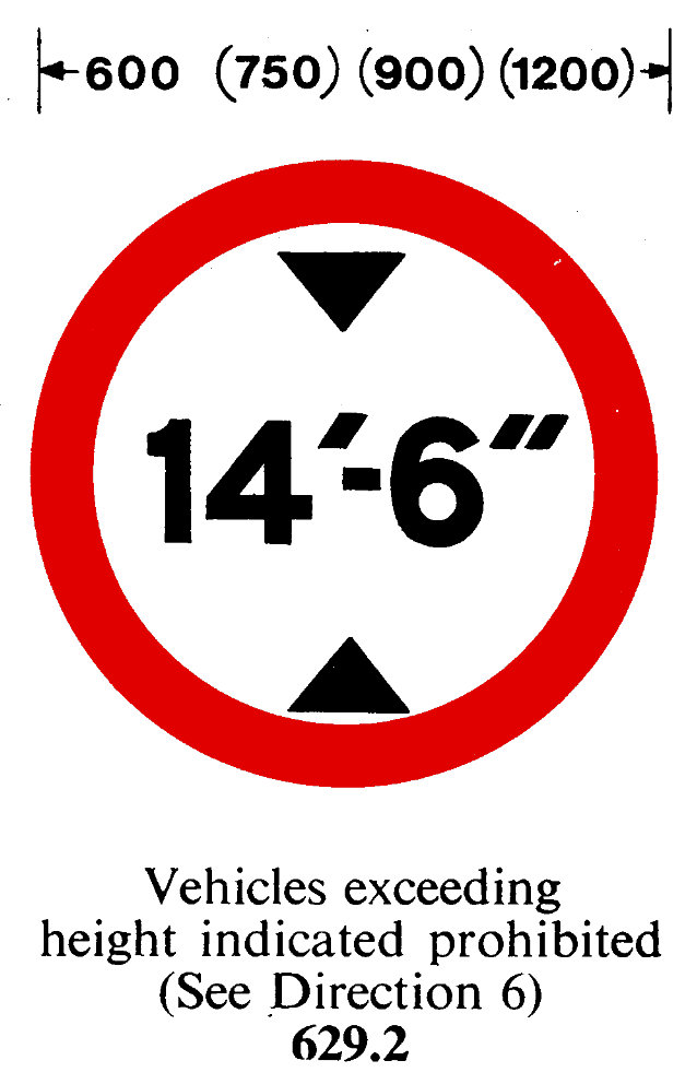
1975
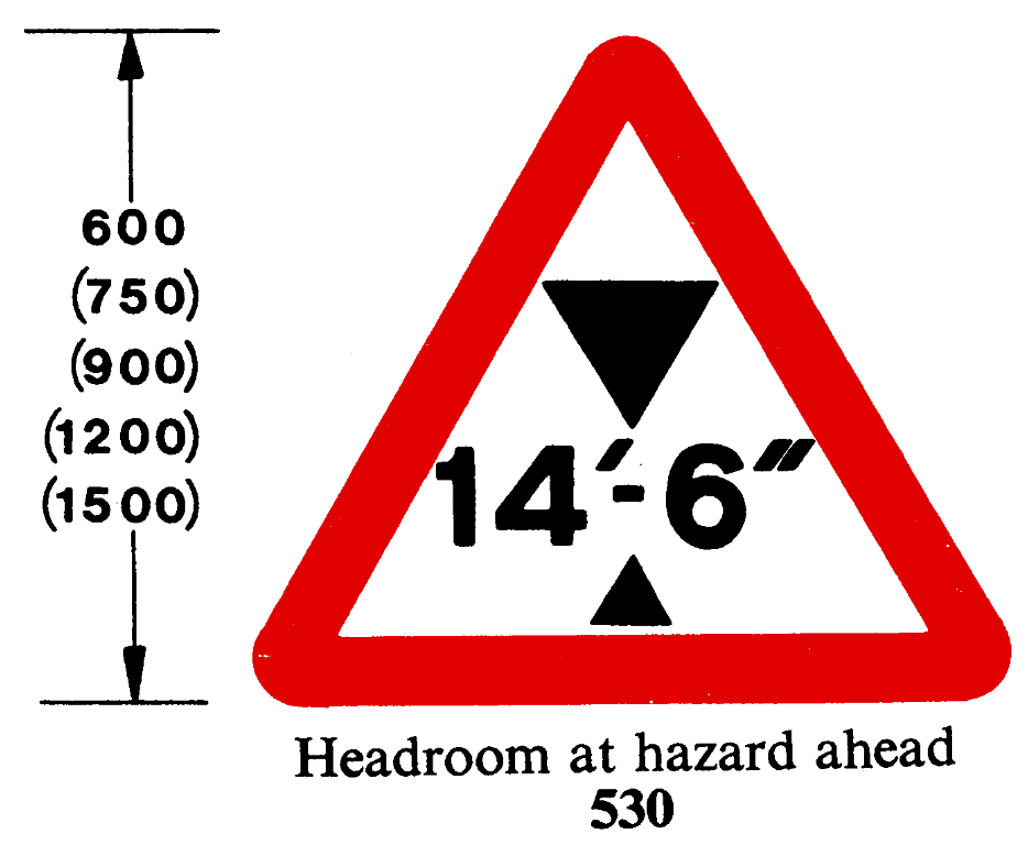
1975
1975
In 1981, the second type of triangle (without the lower black triangle) was dropped – warning signs both in advance and on the structure would now look the same.
In 1994, the requirement for the traffic regulation order was dropped and enforceable circles became recommended. Bryn Buck gives a good history on his excellent blog.
All this means that you sometimes see triangles where you expect circles.
How long have signs been dual unit?
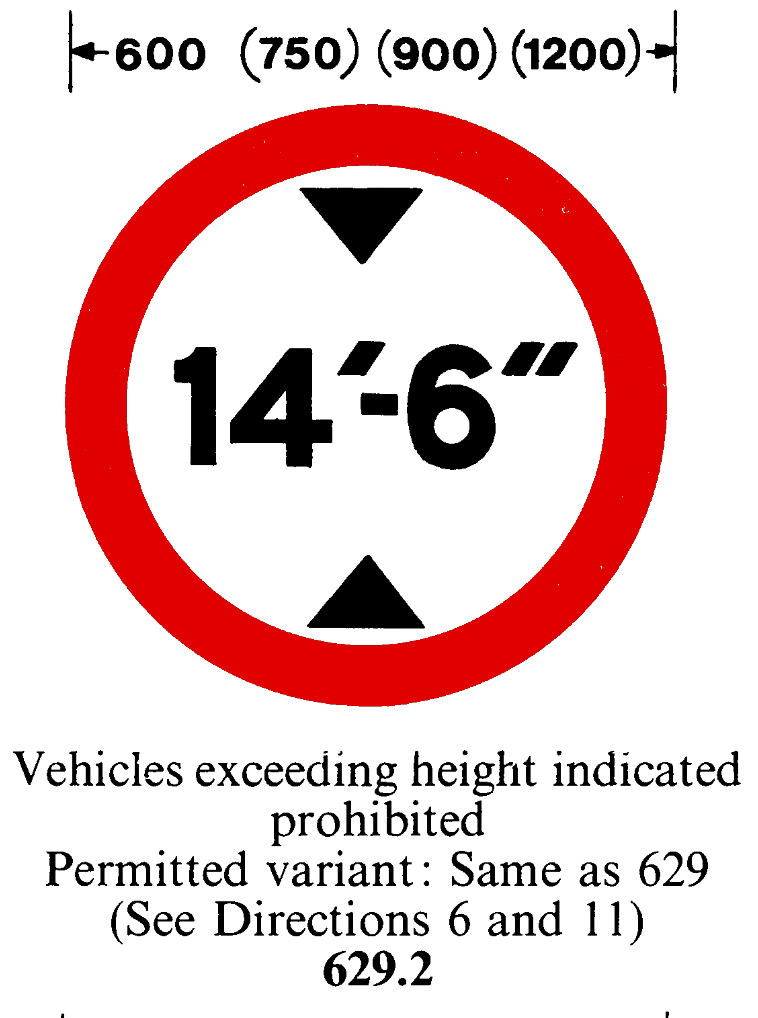
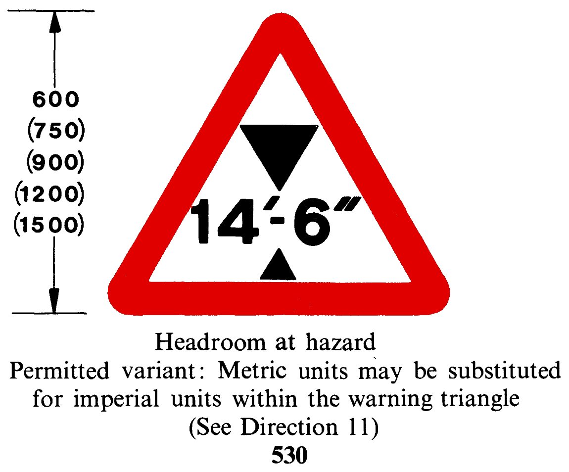
Metric heights were first permitted in 1981, but on separate, adjacent signs to their imperial counterparts. The traffic signs manual didn’t specify what these should look like, more than just saying ‘metric units may be substituted for imperial units’, leading signmakers to… guess? [6, 7]
1981
1981
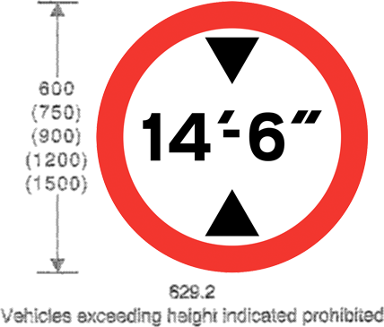
The metric signs which had become conventional were formalised in 1994, when the first dual-unit circle was also introduced. These had to be one size bigger to account for the extra line of text: [8]
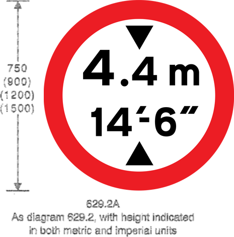
1994
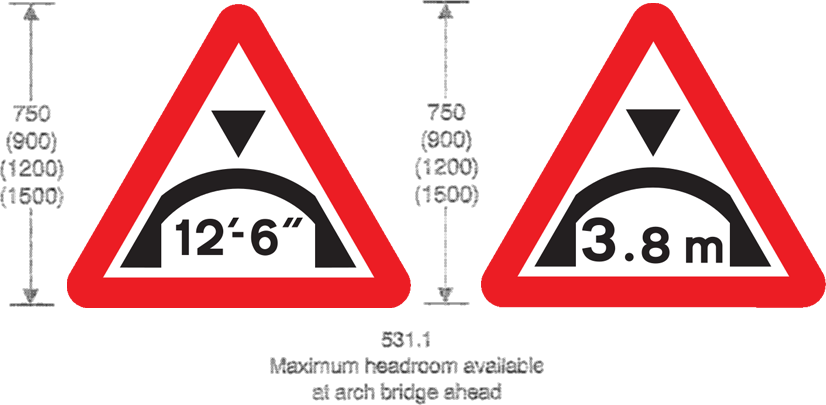
1994
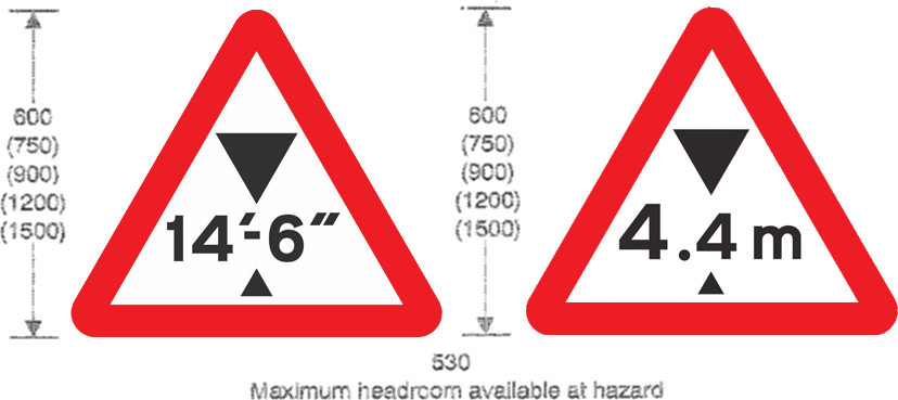
1994
Dual-unit circles become mandated on new signs, along with new dual-unit triangles in 2016: [9]
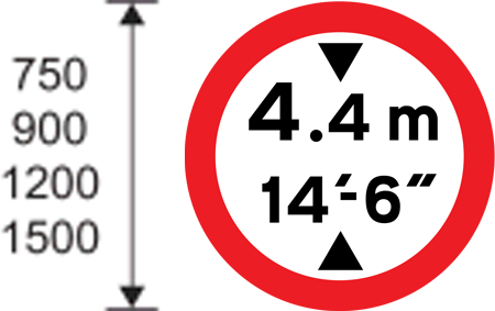
2016
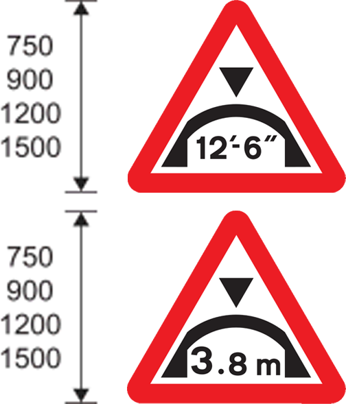
2016
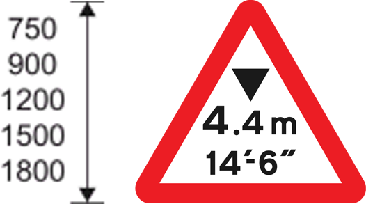
2016
In the Height Hunt, we are only interested in dual-unit signs, so we expect to see more circles than triangles.
How did you find the signs?
I started the Height Hunt in 2020, walking around London and ticking off as many low bridges as I could find. I predominantly looked in areas around railway lines.
I then found
- Chris Minihan’s 2018 dataset of low bridges,
- TfL’s data on height restrictions in London, and
- a 2018 truckers’ atlas, which I went through page by page.
These sources only display heights in imperial, so I checked each location on Google Street View to see whether a dual-unit sign was present, and if so, what the metric height was.
In many cases, streets had been resurfaced since the data was collected and the posted height restrictions had changed. At the start of the project, Street View imagery was often quite old (circa 2012) outside of cities. Dual units became mandated on new signs in 2016, so it was possible that new, uncollected signs existed but weren’t recordered anywhere. This led to a few reconnaissance missions. Thankfully, since then, Street View has been updated in many areas, and the Height Hunt has become slightly easier!
The rule is that I have to visit the location to take photos and confirm the sign's current existence: Street View is not enough!
I also scraped data available in OpenStreetMap. Marc Marí alerted me to Network Rail’s data in April 2026, which lists clearance in both units.
Which signs are on the list?
All valid signs for each millimetre value from 1000mm to 5000mm are listed.
Alternatively, you could only list signs for each centimetre value from 100cm to 500cm: this generates a list which is four (collected!) signs shorter. It seems plausible that, in practice, heights are actually measured in metric and then converted. So really this depends on whether you think that the metric measurement is rounded to centimetres before or after the imperial conversion.
I've found a sign not on your list!
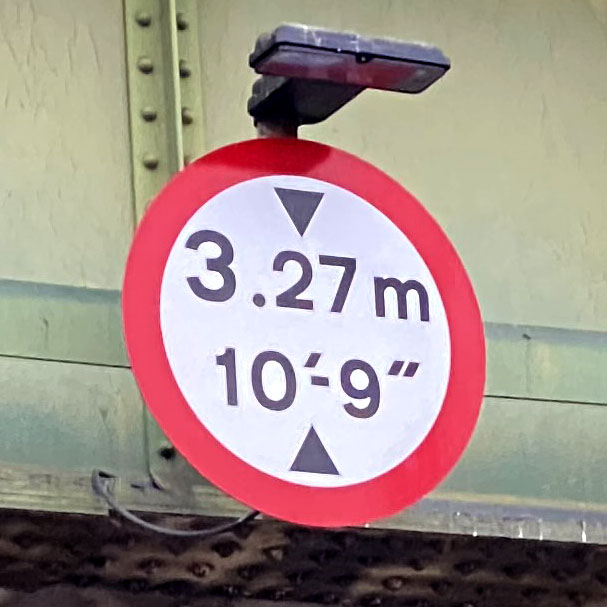
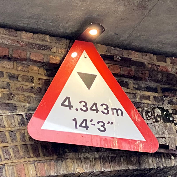
There are quite a few signs in the wild which technically aren’t possible if you follow the traffic manual instructions. Sometimes this manifests as too many metric decimal places, or inches that aren't a multiple of 3. Sometimes the multiples are fine but it's a combination that shouldn’t be possible at all.
I suspect in some of the latter cases, this is because a new metric measurement was added to an existing, older imperial measurement without confirming they matched. Anyone can buy signs – there are no checks at the manufacturing stage.
What's the rarest sign?
The rarest signs are for the lowest bridges!
The signs with the smallest possible range are 3.5m/11′‒3″ and 1.9m/6′‒0″ (unfound), valid each for only a 2mm range. I feel like the latter must exist on a car park somewhere.
The sign I cannot find, despite having a larger range of 7mm, is 2.2m/7′‒0″. If you find it, get in touch!
7`0"
The lowest sign I know of is 1.3m/4′‒3″, in Burntisland, in southeast Scotland. It was found by Ayliean MacDonald by searching for ‘scary low bridge’ on social media. Nice work, Ayliean!
Why are you doing this?
Because this is only a funny MathsJam talk if I’ve actually committed to it.
Thanks
My thanks to Bryn Buck, the road sign expert, and the Sabre community for their help and advice on the history of UK road signs.
Thanks to everyone who has contributed sightings, and to those who have shared the project on social media. Have you found a sign I'm missing? Get in touch!
References and licensing
[1] Report of the Departmental Committee on Traffic Signs (composite)[2] The Traffic Signs Regulations and General Directions 1964
[3] Bryn Buck, Twitter
[4] The Traffic Signs Regulations and General Directions 1975
[5] Jim Stanton, Twitter
[6] The Traffic Signs Regulations and General Directions 1981
[7] Bryn Buck, Twitter
[8] The Traffic Signs Regulations and General Directions 1994
[9] The Traffic Signs Regulations and General Directions 2016
Contains public sector information licensed under the Open Government Licence v3.0.

